Creating a responsive WordPress theme ensures your website looks and works great on any device. Here’s a quick guide to get started:
Why Responsive Design Matters:
- Better User Experience: Easy navigation on all devices.
- SEO Boost: Google prioritizes mobile-friendly sites.
- Simpler Maintenance: One codebase for all devices.
- Future-Proof: Adapts to new devices and screen sizes.
Key Steps to Build a Responsive Theme:
- Use Mobile-First CSS: Start with styles for small screens, then add for larger ones using media queries.
- Flexible Grids: Use percentages and relative units for layouts.
- Responsive Media: Ensure images and videos scale properly.
- Essential Skills: Learn HTML5, CSS3, PHP, JavaScript, and WordPress standards.
- Tools to Use: Visual Studio Code, Local by WP Engine, Chrome DevTools, Git, and design tools like Figma.
Theme Framework Setup:
- Create essential files like
style.css,index.php, andfunctions.php. - Add viewport meta tags for proper scaling.
- Organize files into folders for CSS, JavaScript, images, and templates.
Performance Tips:
- Use lazy loading for images.
- Minify CSS, JavaScript, and HTML.
- Enable GZIP compression and browser caching.
Accessibility Checklist:
- Ensure keyboard navigation.
- Use proper color contrast.
- Add alt text for images.
How to Create a Custom WordPress Theme – Full Course
Required Skills and Tools
Learn the key technical skills and tools you need to create responsive WordPress themes.
Basic Technical Skills
To develop a responsive WordPress theme, you’ll need a solid grasp of these core technologies:
HTML5 and CSS3
- Write semantic, well-structured HTML.
- Use CSS confidently, including Flexbox and Grid layouts.
- Understand CSS preprocessors like SASS or LESS.
- Apply media queries to handle responsive breakpoints.
PHP and WordPress
- Know the basics of PHP.
- Understand WordPress template hierarchy.
- Work with WordPress hooks and filters.
- Follow WordPress theme development standards.
JavaScript Fundamentals
- Handle DOM manipulation effectively.
- Use jQuery for WordPress compatibility.
- Familiarize yourself with modern ES6+ features.
- Implement AJAX for dynamic content updates.
Development Software
Having the right tools can make your theme development process smoother and more efficient:
Code Editors
- Use Visual Studio Code with helpful extensions like:
- PHP Intelephense
- WordPress Snippets
- Live Sass Compiler
- ESLint
Local Development Environment
- Try Local by WP Engine (formerly Local by Flywheel) for features like:
- Built-in SSL support
- Quick site setup
- Easy database management
- One-click staging environments
Browser Developer Tools
- Rely on tools like Chrome DevTools for:
- Testing responsive designs
- Debugging CSS issues
- Monitoring performance
- Analyzing network requests
Version Control
- Use Git for managing your code.
- Host repositories on GitHub or Bitbucket.
- Consider tools like SourceTree or GitKraken for a visual Git interface.
Design and Prototyping
- Create mockups with Figma or Adobe XD.
- Optimize images with ImageOptim.
- Use tools to refine SVG files for better performance.
Building the Theme Framework
Once you’ve outlined the benefits of responsive design, it’s time to set up your theme’s core framework.
Essential Theme Files
A responsive WordPress theme needs a few key files to get started:
style.css
/*
Theme Name: Your Responsive Theme
Theme URI: https://yourtheme.com
Author: Your Name
Description: A responsive WordPress theme
Version: 1.0
License: GNU General Public License v2 or later
*/
index.php
<?php get_header(); ?>
<main class="site-main">
    <?php if (have_posts()) : while (have_posts()) : the_post(); ?>
        <article class="post">
            <?php the_content(); ?>
        </article>
    <?php endwhile; endif; ?>
</main>
<?php get_footer(); ?>
functions.php
<?php
function responsive_theme_setup() {
    add_theme_support('title-tag');
    add_theme_support('post-thumbnails');
    add_theme_support('responsive-embeds');

    register_nav_menus(array(
        'primary' => 'Primary Menu',
        'mobile' => 'Mobile Menu'
    ));
}
add_action('after_setup_theme', 'responsive_theme_setup');
Adding Viewport Meta Tags
To ensure your theme looks great on all devices, include viewport meta tags in the header.php file:
<!DOCTYPE html>
<html <?php language_attributes(); ?>>
<head>
    <meta charset="<?php bloginfo('charset'); ?>">
    <meta name="viewport" content="width=device-width, initial-scale=1, shrink-to-fit=no">
    <?php wp_head(); ?>
</head>
<body <?php body_class(); ?>>
The viewport meta tag ensures your site scales properly on different devices. The initial-scale=1 prevents automatic zooming on mobile, while shrink-to-fit=no resolves rendering quirks on iOS.
Organizing Your Theme Files
Follow this structure to keep your theme files well-organized:
theme-name/
├── assets/
│   ├── css/
│   │   ├── style.css
│   │   └── responsive.css
│   ├── js/
│   │   └── main.js
│   └── images/
├── inc/
│   ├── customizer.php
│   └── template-functions.php
├── template-parts/
│   ├── content.php
│   └── content-page.php
├── index.php
├── functions.php
├── header.php
├── footer.php
└── style.css
To keep your CSS modular, separate responsive styles into a dedicated file (responsive.css). Add it to your theme using this function:
function enqueue_responsive_styles() {
    wp_enqueue_style('responsive-styles',
        get_template_directory_uri() . '/assets/css/responsive.css',
        array(),
        '1.0'
    );
}
add_action('wp_enqueue_scripts', 'enqueue_responsive_styles');
This structure simplifies updates and ensures your theme is easy to maintain. Use wp_enqueue_script() to include JavaScript files from the js directory. Reusable template parts can be stored in the template-parts folder to avoid repeating code.
With this foundation, you’re ready to dive into CSS and fine-tune your layout.
sbb-itb-976b402
CSS and Layout Development
Mobile-First CSS Approach
Start with mobile-first styles to create a design that adjusts smoothly to different screen sizes. Use a base CSS file tailored for mobile devices:
/* Base mobile styles */
.site-content {
    padding: 1rem;
    max-width: 100%;
}

.main-navigation {
    display: none; /* Hide desktop menu */
}

.mobile-menu {
    display: block;
}

/* Mobile typography */
h1 { font-size: 1.75rem; }
h2 { font-size: 1.5rem; }
p { font-size: 1rem; line-height: 1.6; }
Then, use media queries to add styles for larger screens:
/* Tablet (768px and up) */
@media screen and (min-width: 48em) {
    .site-content {
        padding: 2rem;
        max-width: 720px;
        margin: 0 auto;
    }

    .mobile-menu {
        display: none;
    }

    .main-navigation {
        display: block;
    }
}

/* Desktop (1024px and up) */
@media screen and (min-width: 64em) {
    .site-content {
        max-width: 960px;
    }
}
Flexbox and Grid Layouts
Once the mobile foundation is ready, use Flexbox and Grid to refine your layout and organize content effectively.
/* Flexbox for header navigation */
.site-header {
    display: flex;
    flex-wrap: wrap;
    align-items: center;
    justify-content: space-between;
    padding: 1rem;
}

/* Grid for blog post listings */
.post-grid {
    display: grid;
    grid-template-columns: repeat(auto-fit, minmax(280px, 1fr));
    gap: 2rem;
    padding: 1rem;
}

/* Adaptive sidebar layout */
.content-area {
    display: grid;
    grid-template-columns: 1fr;
    gap: 2rem;
}

@media screen and (min-width: 48em) {
    .content-area {
        grid-template-columns: 2fr 1fr;
    }
}
Bootstrap Integration Steps
After setting up your CSS, you can expand your design’s flexibility by integrating Bootstrap. Here’s how:
1. Add Bootstrap Files
Enqueue Bootstrap in your functions.php file:
function enqueue_bootstrap_files() {
    wp_enqueue_style('bootstrap-css',
        'https://cdn.jsdelivr.net/npm/bootstrap@5.3.0/dist/css/bootstrap.min.css'
    );

    wp_enqueue_script('bootstrap-js',
        'https://cdn.jsdelivr.net/npm/bootstrap@5.3.0/dist/js/bootstrap.bundle.min.js',
        array('jquery'),
        '5.3.0',
        true
    );
}
add_action('wp_enqueue_scripts', 'enqueue_bootstrap_files');
2. Use Bootstrap Grid
In your template files, apply Bootstrap’s grid classes to structure your content:
<div class="container">
    <div class="row">
        <main class="col-12 col-md-8">
            <?php while (have_posts()) : the_post(); ?>
                <article class="card mb-4">
                    <div class="card-body">
                        <?php the_content(); ?>
                    </div>
                </article>
            <?php endwhile; ?>
        </main>
        <aside class="col-12 col-md-4">
            <?php get_sidebar(); ?>
        </aside>
    </div>
</div>
3. Customize Bootstrap
Create a custom CSS file to override Bootstrap defaults:
/* custom-bootstrap.css */
:root {
    --bs-primary: #0073aa;
    --bs-font-sans-serif: -apple-system, system-ui, BlinkMacSystemFont;
}

.navbar-brand {
    font-size: 1.5rem;
    font-weight: 600;
}

.card {
    border-radius: 0.5rem;
    box-shadow: 0 2px 4px rgba(0,0,0,0.1);
}
Theme Testing and Performance
Device Testing Guide
Make sure your theme works seamlessly across devices and browsers. Chrome DevTools’ Device Mode is a handy tool for simulating various screen sizes and orientations. Focus on commonly used U.S. device configurations:
// Example viewport sizes (in pixels)
const breakpoints = {
    iPhone13: { width: 390, height: 844 },
    iPadAir: { width: 820, height: 1180 },
    SamsungS21: { width: 360, height: 800 },
    Desktop: { width: 1920, height: 1080 }
};
For hands-on testing with real devices, follow these steps:
- Browser Compatibility Testing
- Test on Chrome (desktop and mobile)
- Safari (iOS and macOS)
- Firefox
- Microsoft Edge
- Interaction Testing
- Check touch gestures
- Test mouse hover effects
- Verify form field behaviors
- Inspect menu animations
After confirming your theme’s functionality on devices, shift your focus to boosting performance.
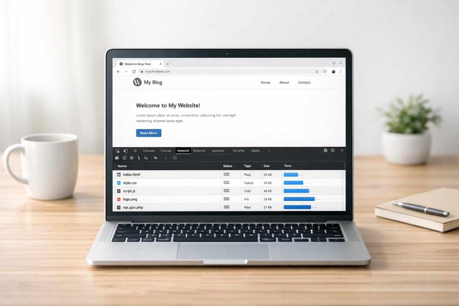
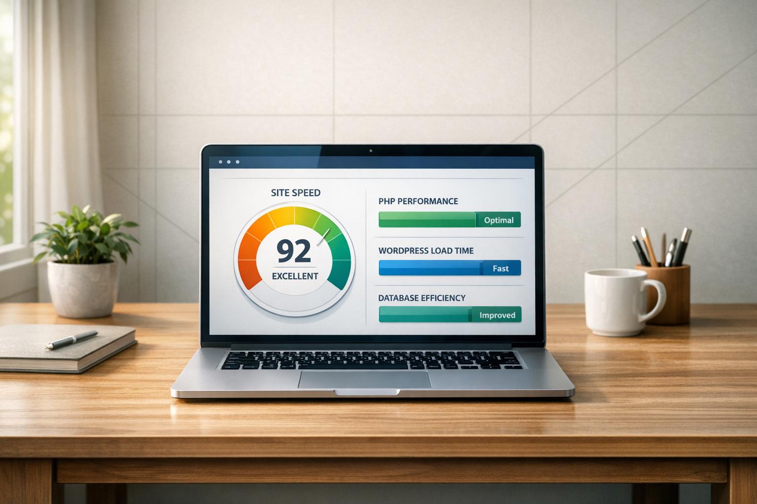
Performance Optimization
Speed is crucial. Use the following techniques to improve load times:
// Enable GZIP compression in .htaccess
<IfModule mod_deflate.c>
    AddOutputFilterByType DEFLATE text/html text/plain text/css application/javascript
</IfModule>

// Set up browser caching
<IfModule mod_expires.c>
    ExpiresActive On
    ExpiresByType image/jpg "access plus 1 year"
    ExpiresByType image/webp "access plus 1 year"
    ExpiresByType text/css "access plus 1 month"
    ExpiresByType application/javascript "access plus 1 month"
</IfModule>
Performance Tips:
- Combine CSS and JavaScript files to cut down on HTTP requests.
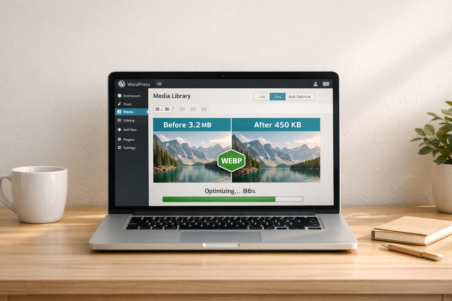
- Use lazy loading for images to improve initial page load speed.
- Switch to WebP image format, but include fallbacks for older browsers.
- Enable server-side caching.
- Minify CSS, JavaScript, and HTML files.
Once your site is running efficiently, focus on accessibility to make it usable for everyone.
ADA Compliance Steps
Follow WCAG 2.1 standards to ensure your theme is accessible:
/* High-contrast focus styles */
:focus {
    outline: 3px solid #4A90E2;
    outline-offset: 2px;
}

/* Skip navigation link */
.skip-link {
    position: absolute;
    left: -999px;
    background: #fff;
    padding: 1rem;
    z-index: 999;
}

.skip-link:focus {
    left: 0;
}
Accessibility Must-Haves:
- Use a clear heading hierarchy (H1 to H6).
- Add meaningful alt text for all images.
- Maintain a minimum color contrast ratio of 4.5:1.
- Ensure keyboard navigation works and use ARIA labels for interactive elements.
For expert help with WordPress performance and accessibility, check out WP Support Specialists. Their managed hosting and maintenance services can keep your theme fast, secure, and aligned with modern web standards while reducing technical challenges.
Summary and Resources
Key Development Steps
Creating a responsive WordPress theme involves several important stages. Here’s a breakdown of the process:
| Development Phase | Key Components | Technical Focus |
|---|---|---|
| Foundation Setup | Theme files, viewport tags | File structure, meta tags |
| Layout Design | Mobile-first CSS, grid systems | Flexbox, Bootstrap |
| Testing Protocol | Device testing, browser compatibility | Chrome DevTools, real devices |
| Performance | Performance tuning, caching | GZIP, image optimization |
| Accessibility | WCAG 2.1 compliance | ARIA labels, contrast ratios |
Each phase plays a crucial role in ensuring your WordPress theme is functional, efficient, and accessible. For ongoing maintenance and issue resolution, professional WordPress support can help keep your theme updated and running smoothly.
Professional WordPress Support
Once you’ve covered the essential steps, maintaining a responsive WordPress theme is an ongoing task. Regular updates are necessary to align with evolving web standards. WP Support Specialists offer maintenance services to ensure your theme stays secure and optimized.
“We’re here to help people who believe building, maintaining & optimising websites should be simple, smooth, and as stress-free as possible. We promise that by trusting us with your WordPress website, you’ll get the peace of mind to focus on running and building your business each day.”
- WP Support Specialists
Their services include:
- Theme maintenance and updates
- Performance optimization
- Security monitoring
- Emergency support with a 2-hour response time
FAQs
What are the advantages of using a mobile-first approach when creating a responsive WordPress theme?
A mobile-first approach ensures your WordPress theme is optimized for smaller screens first, then scales up for larger devices. This method improves usability on mobile devices, which is crucial given the growing number of mobile users.
By prioritizing mobile design, you can create a cleaner, faster-loading experience that enhances performance and accessibility. It also simplifies scaling for larger screens, ensuring your site looks great and functions well on all devices, from smartphones to desktops.
How can I make my WordPress theme accessible for users with disabilities?
To ensure your WordPress theme is accessible for users with disabilities, focus on implementing Web Content Accessibility Guidelines (WCAG). Start by using semantic HTML to structure your content clearly and include alt text for all images. Ensure your site is navigable via keyboard and screen readers by correctly labeling form elements and using ARIA (Accessible Rich Internet Applications) roles where necessary.
Additionally, prioritize sufficient color contrast between text and background, and avoid relying solely on color to convey meaning. Testing your theme with accessibility tools, such as screen readers or online checkers, can help identify and fix potential issues. By following these steps, you can create an inclusive experience for all users.
What are the best tools and techniques to optimize a responsive WordPress theme?
Optimizing a responsive WordPress theme involves several key techniques to enhance performance and user experience. Focus on using lightweight themes, implementing mobile-first design principles, and reducing unnecessary code. Tools like CSS preprocessors and grid systems can streamline your design process, while image compression tools and caching plugins can significantly improve load times.
For more advanced optimization, consider professional services that specialize in WordPress performance, including hosting, security audits, and malware removal. These services ensure your site runs smoothly and remains secure, providing a reliable experience for your users.