A responsive WordPress website is essential in today’s digital landscape, where more and more people are accessing the internet on a variety of devices.
A responsive website automatically adjusts to the size and orientation of the device it is being viewed on, ensuring that it is easy to use and navigate regardless of the device.
If you have a WordPress website and want to make it more responsive,you’re in the right place.
We’ll walk you through the steps to make your WordPress site more responsive and ensure that it provides a seamless user experience for all of your visitors.
Key Takeaways
- Start with a theme built for responsiveness and deploy fluid grid layouts so your site adjusts gracefully across different screen sizes.
- Ensure images and videos scale properly using responsive techniques and use relative units (such as rem) for font sizes.
- Make navigation adaptable by using responsive menu plugins (e.g., WP Mobile Menu, Responsive Menu) or custom media-query–based styles (such as a dropdown for small screens) for smoother mobile use.
- Improve loading speeds with tools like CDNs, Google PageSpeed Insights, or GTmetrix, and regularly test responsiveness using tools like Chrome DevTools, Google Mobile‑Friendly Test, or Responsive Design Checker.
- Use browser developer tools to diagnose layout or CSS issues, disable recent plugins or switch to a default theme to isolate problems.
Choose A Responsive WordPress Theme
The first step to making your WordPress website responsive is choosing the correct themes. A responsive WordPress theme is one that has been designed to automatically adjust to the device it is being viewed on.
There are many free and premium responsive themes available for WordPress. To find a theme, go to the Appearance > Themes section of your WordPress dashboard and click on the “Add New” button.
From here, you can browse through the available themes and preview them before selecting one.
Making Preset Themes More Responsive
But what if you’ve found a theme you’d like to keep, but want to tinker with a bit to get the best functionality? WordPress and many of its free themes are open source, which means you can change things as you need to.
One of the things you or your developer can do is use a responsive design framework. There are many design frameworks available that can help you create a responsive website quickly and easily.
These frameworks typically include a set of CSS styles and layout templates that are designed to be responsive. Some popular frameworks include Bootstrap, Foundation, and Materialize.
Responsive design patterns such as the mobile-first pattern, the desktop-down pattern, and the hybrid pattern should also give your site the versatility it needs. Each of these patterns has its own advantages and disadvantages, and the best one for your website will depend on your specific needs and goals.
Media queries are another way your site can appear the same no matter what device it’s viewed on. These are CSS rules that allow you to apply styles based on the characteristics of the device that is being used to view your website. You can use media queries to create different styles for different screen sizes and orientations, making your theme more responsive.
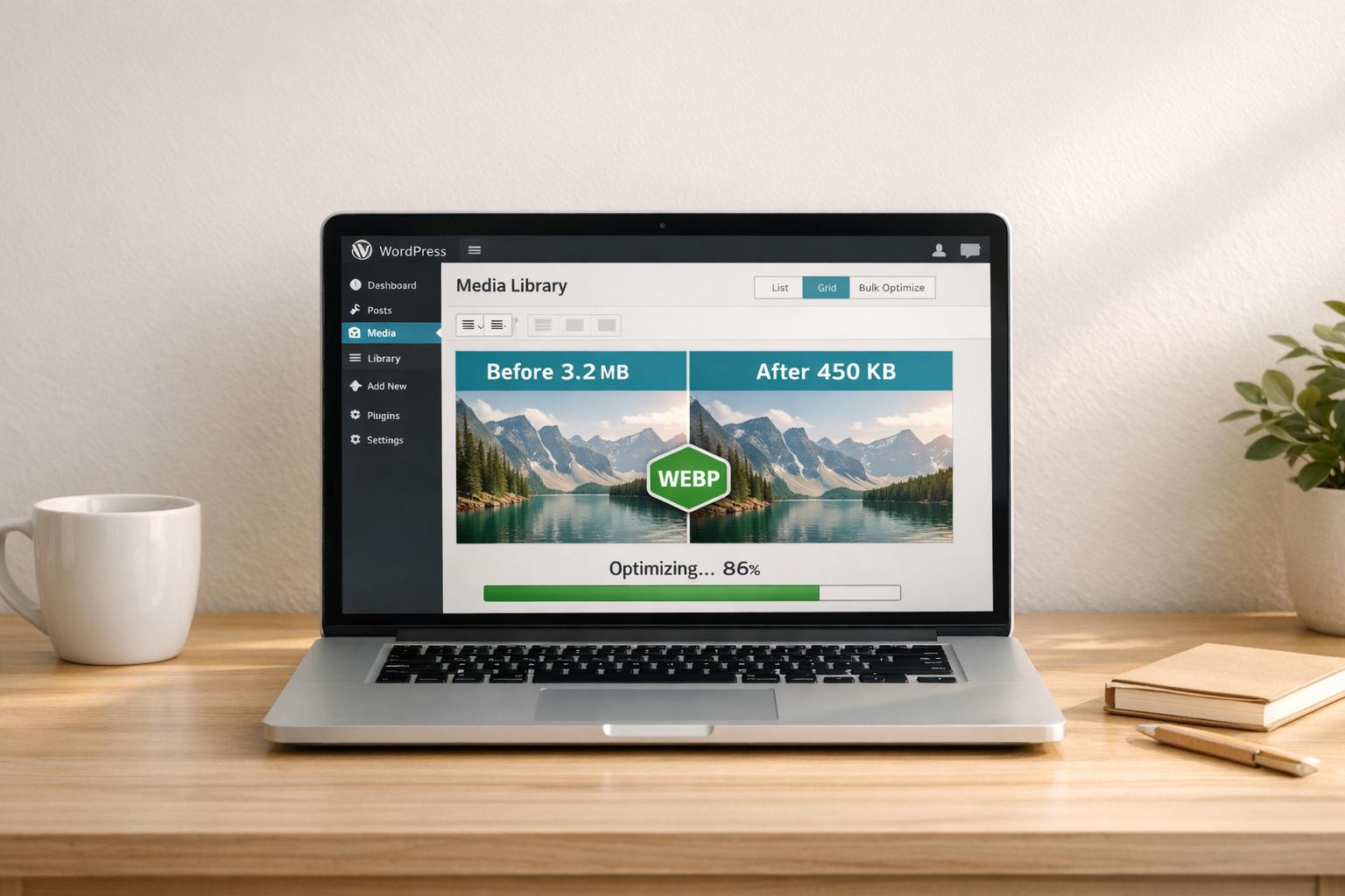
Use Responsive Images
This is one of the key elements of a responsive WordPress website. This means that the images on your website will automatically adjust to the size of the device they are being viewed on.
To use responsive images in WordPress, you can use the srcset attribute. This attribute allows you to specify different versions of an image for different screen sizes.
For example, you could have a small version of an image for mobile devices, a medium version for tablets, and a large version for desktop computers.
To use the srcset attribute, you will need to edit your theme’s template files. In your theme’s functions.php file, you can add the following code to enable srcset for your images:
add_filter( 'wp_calculate_image_srcset', '__return_true' );
Pro Tip: For advanced responsiveness, consider defining custom image breakpoints in your
srcsetby using WordPress hooks likewp_calculate_image_srcset_thresholds(). This ensures images are served at exactly the right dimensions for varying device sizes, improving load times and enhancing visual quality.
Other Design Elements To Make A WordPress Website Responsive
Images and videos
In addition to responsive images, you can also make your website’s videos responsive by using a responsive video embed plugin or by using the fitvids.js library.
These tools allow your website’s videos to automatically adjust to the size of the device they are being viewed on.
Ad Units
If you are using ads on your website, it’s important to ensure that they are responsive as well.
You can use responsive ad units from networks like Google AdSense or use a plugin like WP Quads to make your ad units responsive.
Font sizes
In addition to using responsive images and layout templates, it’s also important to use responsive font sizes to ensure that your website’s text is easy to read on all devices.
You can use the “rem” unit in your CSS to set responsive font sizes.
Become Mobile Friendly
Statista says 4.32 billion people use their mobile phones to access the Internet. That’s 54 percent or over half of the world’s population. They won’t be able to see your site if it isn’t mobile friendly. Even if they do, if it’s not easy to navigate, they’ll just move on to someone else’s.
Your website’s menu should be easy to use on all devices, including smartphones and tablets. There are several ways to create a mobile-friendly menu in WordPress.
One option is to use a responsive menu plugin, such as WP Mobile Menu or Responsive Menu. These plugins allow you to create a separate mobile menu that will automatically display when your website is viewed on a small screen.
Alternatively, you can create a mobile-friendly menu by using the CSS media queries we spoke about above. You can use a media query to create a dropdown menu for small screens and a horizontal menu for larger screens.
To create a mobile-friendly menu using media queries, you will need to edit your theme’s stylesheet (style.css). You can add the following code to your stylesheet to create a dropdown menu for small screens:
@media screen and (max-width: 768px) {

  .menu {

    display: none;

  }

  .menu-toggle {

    display: block;

  }

  .menu-item {

    display: block;

  }

}
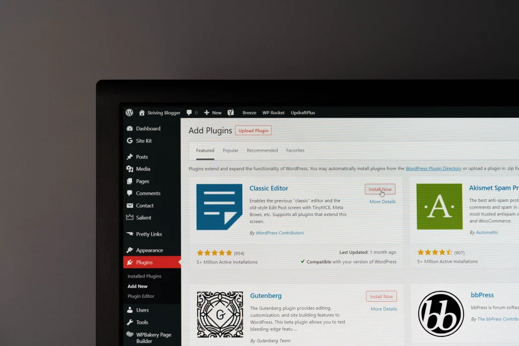
Explore Plugins
Just as with themes, there are plugins you can use to optimize your site’s responsiveness. Plugins such as WPTouch allow you to easily configure your website’s appearance and performance for different devices.
You can also install plugins that alter your fluid grid layout. A fluid grid layout is one that adjusts to the size of the device it is being viewed on. It ensures that the layout of your website looks good on all devices.
To create a fluid grid layout in WordPress, you can use a responsive grid plugin, such as WPBakery Page Builder or SiteOrigin Page Builder. These plugins allow you to create a grid layout by dragging and dropping.
Use a Content Delivery Network (CDN)
A CDN is a network of servers that delivers your website’s content to visitors based on their geographic location. Using a CDN can help improve the performance of your website on mobile devices, as it reduces the distance that data has to travel which make your site appear faster to your visitors further away.
Troubleshooting Common Responsive WordPress Design Issues
Troubleshooting common WordPress responsive design issues can be a challenge, but there are several steps you can take to identify and fix these issues.
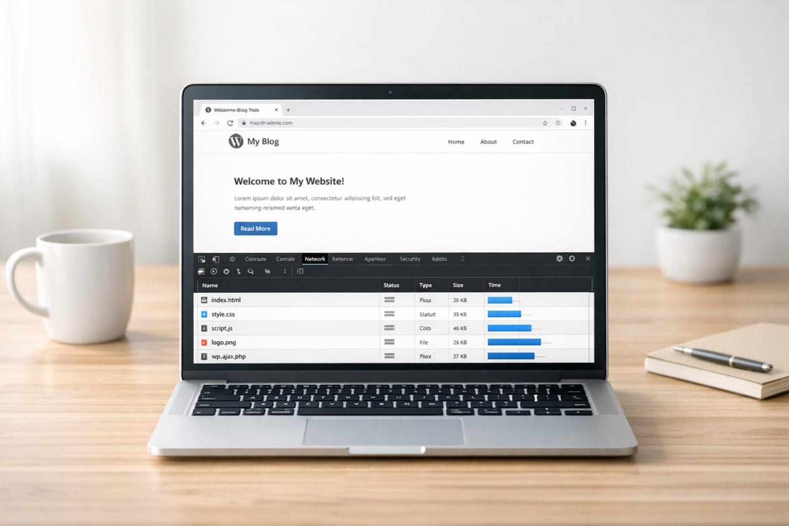
Firstly, you can use browser tools such as the Developer Console or the Chrome Inspect Element feature to check for any errors or issues with your website’s layout and design. This can help you identify any issues with your website’s HTML or CSS code that might be causing WordPress responsive design problems.
You can also try deactivating any plugins or themes that you have recently installed to see if they might be causing issues with your website’s responsiveness.
If none of these steps help, you can try resetting your website’s theme to the default WordPress theme to see if that resolves the issue.
Alternatively, if you are still experiencing responsive design issues after trying all of these troubleshooting steps, you may want to consider consulting a web developer or reaching out to a WordPress support specialist team for further assistance.
Final Checks
When you’ve made your adjustments, you or your developer can test your site’s responsiveness on different devices. Doing this regularly lets you know what your website looks like on different devices and ensures that it is responsive and easy to use. You can use tools like Google Mobile-Friendly Test or Responsive Design Checker to do this.
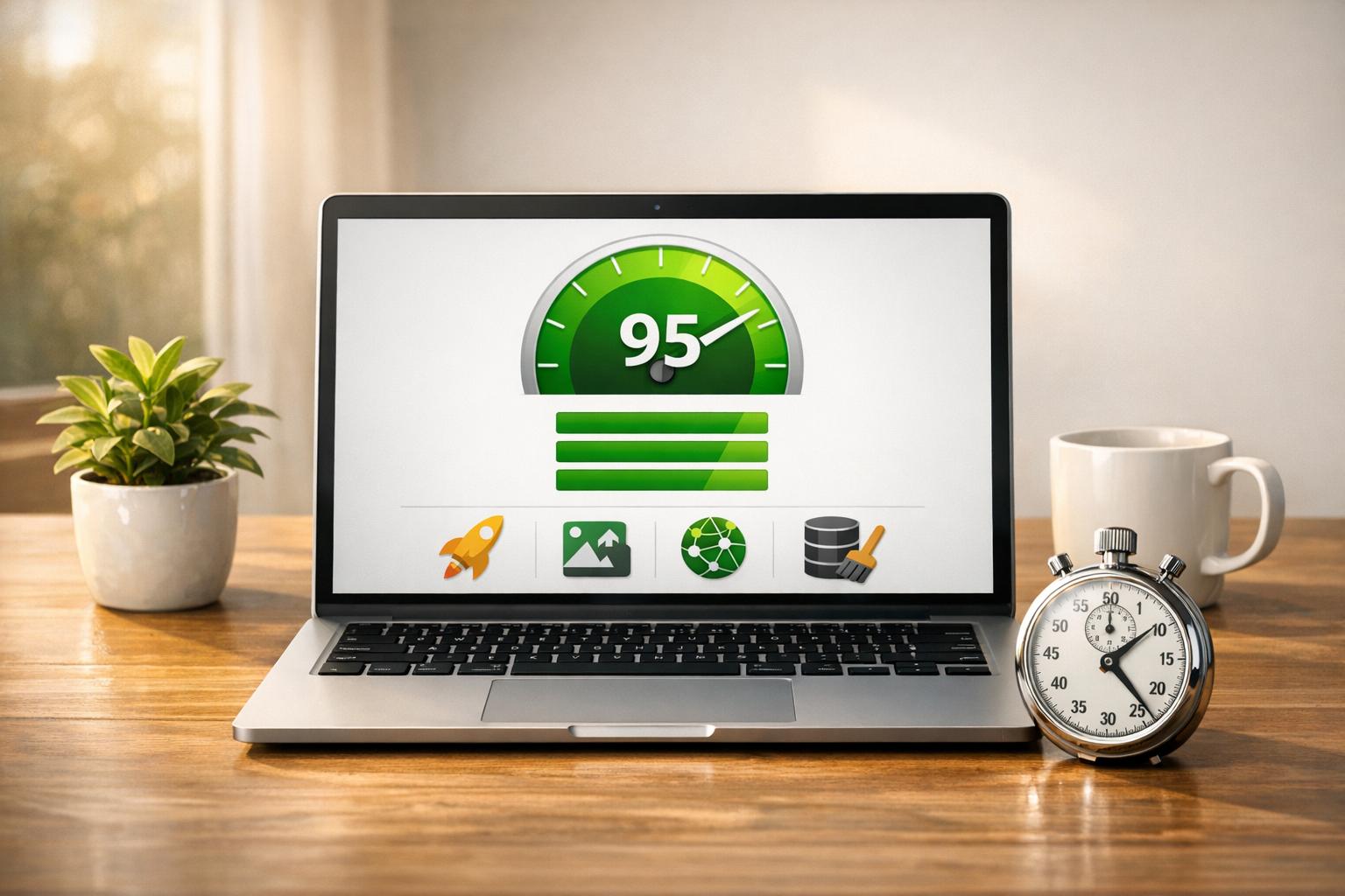
Optimize your website’s loading speed as well. Loading speeds are especially important for mobile users and slower speeds can lead to higher bounce rates. Use tools like Google PageSpeed Insights or GTmetrix to identify issues and fix them.
The Benefits of A Responsive WordPress Site
Having a responsive WordPress website has several advantages. It ensures that your website is easily accessible and user-friendly for visitors on any device, including smartphones, tablets, and laptops.
A responsive website can improve your search engine rankings, as Google and other search engines favor websites that are mobile-friendly. This means that a responsive website can help your website rank higher in search results and attract more organic traffic.
“Responsive design isn’t just about making a site look good on mobile; it’s about creating a consistent experience that builds trust. If your website fails on one device, you risk losing the customer everywhere.” — Kevin Ashcroft, Founder of WP Support Specialists

Finally, a responsive website can also improve your website’s performance and loading speed, which is important for user engagement and retention.
By optimizing your website for different devices, you can provide a fast and smooth browsing experience for your visitors, which can help increase the amount of time they spend on your website and improve their overall satisfaction.
Responsive vs. Adaptive Design
For The Best User Experience
Making your WordPress website more responsive is essential for providing a good user experience for all of your visitors, regardless of the device they are using. By following the steps outlined in this blog post, you can optimize your website for different devices and ensure that it is easy to use and navigate on all devices.
Remember to choose a responsive theme, use responsive images, create a mobile-friendly menu, use fluid grid layouts, and optimize your website’s loading speed. You can also use responsive design patterns, frameworks, and ad units, as well as make your website’s videos and font sizes responsive.
By taking the time to make your WordPress website more responsive, you’ll be able to provide a better experience for your visitors and improve your website’s overall performance.
Remember…
You’re not alone in this journey. Optimizing a WordPress website’s performance can be complicated, especially if you don’t know code or design.
We can help you with your site’s hosting, development, optimization, support, and security.
Take advantage of our expertise and contact us to discuss your needs today. Don’t go it alone – let us help you succeed!”
FAQs
How do I ensure my WordPress site is truly mobile-friendly and not just mobile-compatible?
Use a responsive theme that adapts to different screen sizes out of the box. Then, test and refine using techniques like fluid layouts (percent-based widths instead of fixed pixels), flexible images, and targeted CSS media queries to tweak styles per device.
What are the most important technical elements to apply for responsive design in WordPress?
The essentials include:
- Fluid grid layouts using relative units like %, em, or rem;
- Responsive images with srcset and sizes to serve optimized visuals per device;
- Media queries to fine-tune layouts at specific breakpoints
Beyond that, you can enhance performance using techniques like lazy loading for media, image optimisation (e.g., WebP formats), and CDN delivery to improve loading speed on mobile connections.
How can I maintain responsiveness long-term as nw devices and updates emerge?
Implement a continuous testing and monitoring strategy, so that you’re regularly checking your site’s layout and performance across real devices and emulator tools, especially after theme, plugin, or core updates. It also helps to stay informed about new device breakpoints, browser changes, and emerging design patterns, and refine your CSS, layouts, and theme settings proactively to keep providing a smooth experience across all screens.